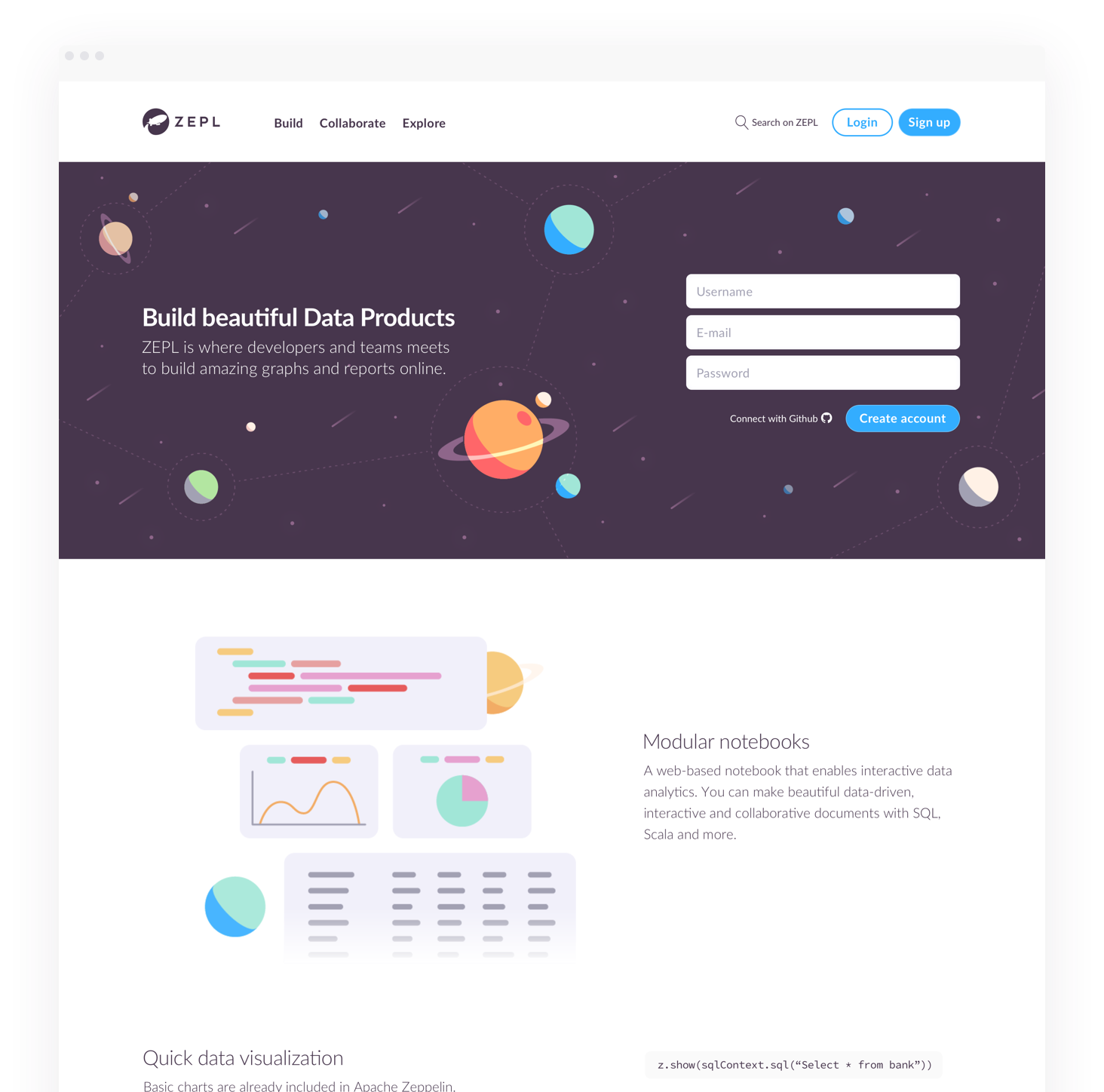
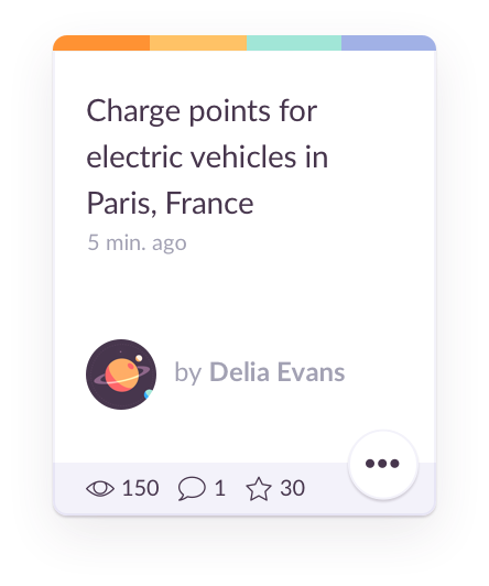
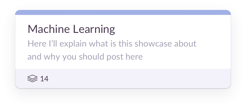
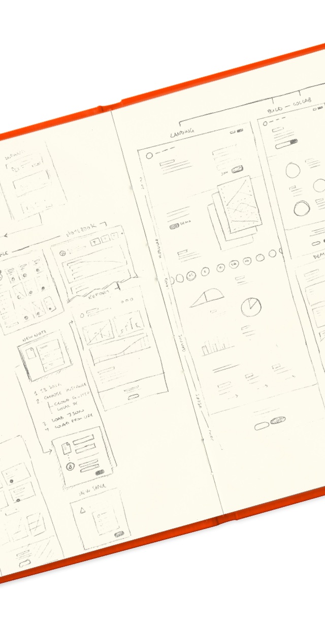
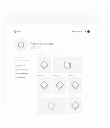
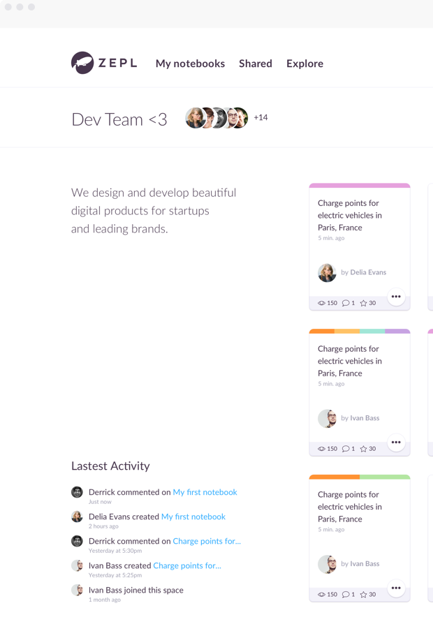
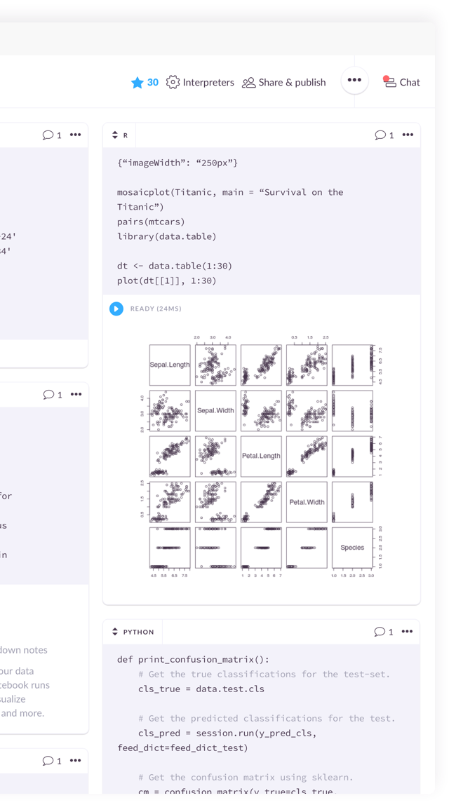
ZeplWeb App Design

THE CHALLENGE

The client asked us to redesign their Big Data platform and make it more user-friendly. The scope of the project was mainly focused on optimizing team collaboration and securing a significant edge over the competition.

Zepl Website Preview  Preview Zepl Card Preview Zepl Card

It all began with a story

ZEPL was kind of hard to use for new users, so we decided to start from, well, the start. First off, we set out to analyze user roles and define objectives for the product based on their needs.

Sketchs about Zepl Website Zepl lo-fi frames
Zepl lo-fi frame Zepl lo-fi frame
Zepl lo-fi frame

Easy navigation calls for clear understanding.

With the idea of clarifying the path that users should take to get things done with ZEPL, we created a new set of guidelines for their Brand style. We used bright colors to build a dynamic color palette that would guide users’ decision making process.

Color Palette
Zepl Buttons UI Zepl Cards UI
Zepl Forms UI

Make it memorable

We wanted illustrations to serve as a clean and engaging visual reminder of the potential that Zepl brings to users, while also reassuring them that their data will always be secure.

Some Styles we dug into-

Universe Style Illustration
Asset 1
Image showing the typography used Image showing the typography used
Data Visualization Icon
Data Visualization
Team Collaboration Icon
Team Collaboration
Business Analysis Icon
Business Analysis
Empty Placeholders
Empty Placeholders
First Comment
First Comment

Sharing is caring

A feature called Spaces lets users share their work with each other. Here’s where they meet to collaborate on Notebooks.

Comparing notes

Notebooks are where work is done. Users code in mixed languages to run visualizations and gather feedback.

Sharing is caring

A feature called Spaces lets users share their work with each other. Here’s where they meet to collaborate on Notebooks.

Image showing the typography used

Comparing notes

Notebooks are where work is done. Users code in mixed languages to run visualizations and gather feedback.

Image showing the typography used

Onboarding different kinds of users

ZEPL hosts Engineers, Managers, and Business Analysts, among other roles. In order to help them learn how they could build, collaborate, and explore the platform, we decided to approach each of them with a dedicated Landing Page.

Image showing the typography used
empry-state1 Created with Sketch.