TranzportWeb Design & Development

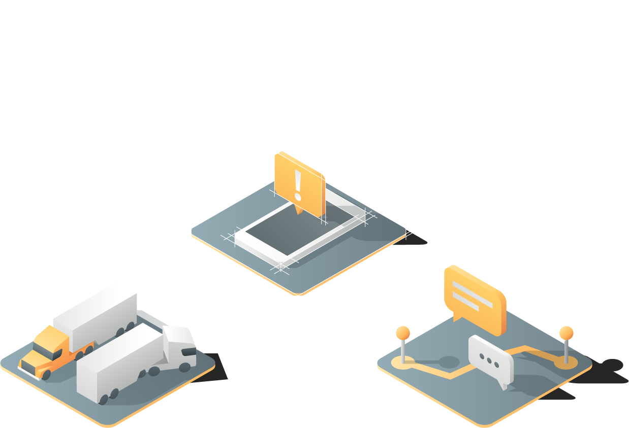
New concept, better UX

Tranzport came to us to modernize their company’s image through a new website and a minor brand update. We set out to highlight the service’s values of efficiency and transparency, as well as their advantages over the competition, while providing users with an engaging and productive experience.

Branding

We made some minor adjustments to the brand’s visual identity. We proposed a series of small tweaks that made it cleaner and more professional, while maintaining the original style.

Original Logo
Adjustments
Our Concept

Typography & Color Palette

We updated the branding elements to include Gibson, a modern, elegant typeface that could be applied in all of the website’s sections, and we determined a color palette that accompanied the experience Tranzport wanted to give their users throughout their website.

Gibson Font Family used for tranzport site
Image showing the typography used
Sunset Sun #ffd051
Night Rider #333333
Jungle Green #26b16a
Header of the actual Tranzport page
Press Information Icon
Blog Icons
Contact Icons
Moving Forward Icon sets
First approach Tranzport illustration
Isometric Tranport illustration guidelines
Isometric tranzport final illustration

Illustrations & Iconography

The website required an extensive system of icons and illustrations, we conceptualized some of Tranzport’s features and filled it with these clean trucks and logistical elements.

Wireframes of the tranzport illustrations

Some of the illustrations

Most of the tranzport illustrations icons Most of the tranzport illustrations icons Most of the tranzport illustrations icons Most of the tranzport illustrations icons
Tranzport illustration pattern

User Experience

To determine the site's different sections and the way in which it would be navigated, we worked on a series of User Flows. The paths of these hypothetical users helped us define the best way to guide visitors around the site in order to fulfill the different needs that Tranzport has the potential of accommodating.

Screenshots of the tranzport site user experience

User Interface

During this stage we took the site’s wireframes and navigation flow and brought it to life through the use of colors, shapes, typefaces, and all the other visual elements we had previously defined. This way we ended up with a clean, solid product that conveyed Tranzport’s values and personality, as well as the competitive advantages of its service. All of this packaged in an appealing format that resonated with customers.

Screenshots of the tranzport site user interface
More iconography used on the user interface
Header used on the Tranzport page