Simple Radio

Designing for the Apple Watch, before it even ships.

Jan 2015 - Mar 2015

01

The_Client

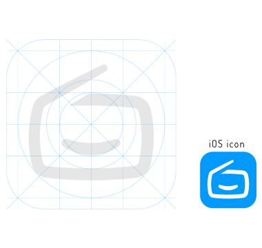
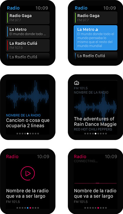
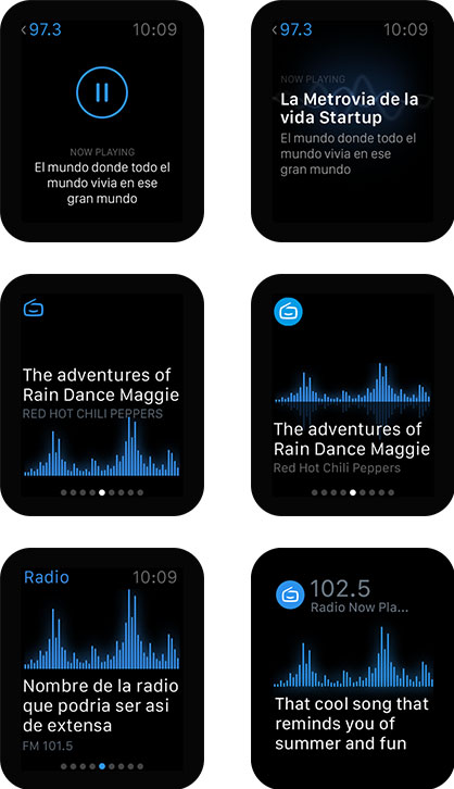
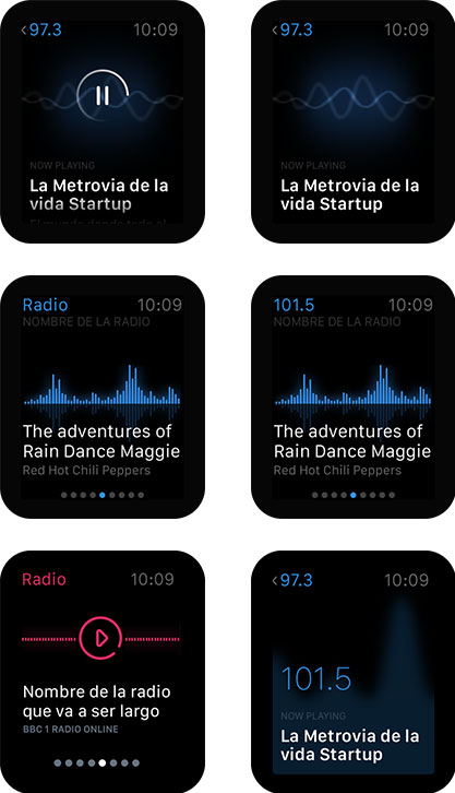
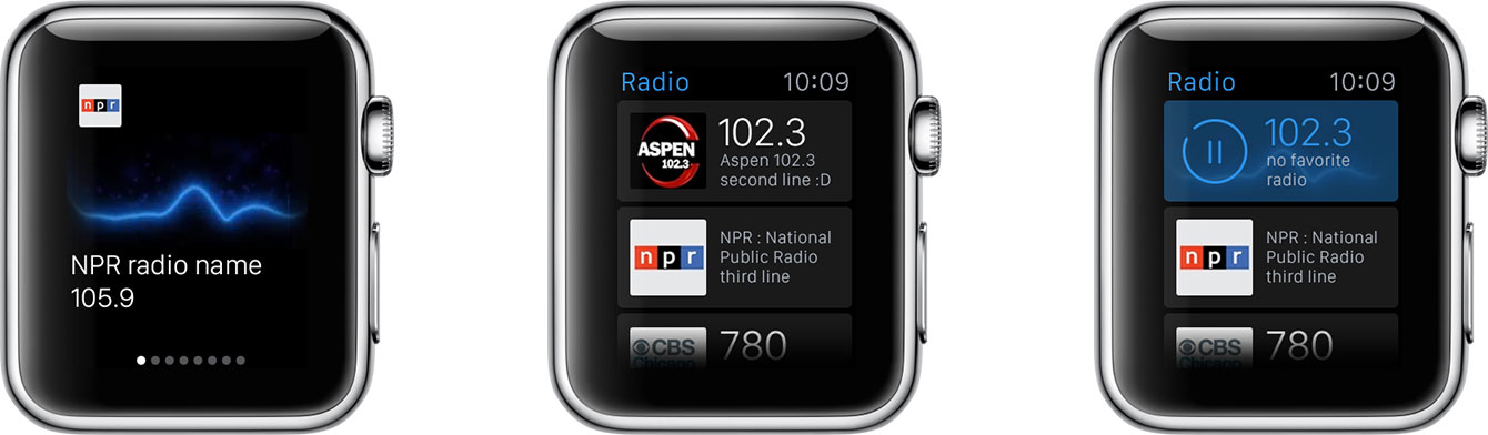
SimpleRadio is a mobile app created by Streema, a web streaming service for radio and TV. The concept behind it is focused on simplicity: search, listen, and bookmark your favorite radios. Millions of listeners worldwide gain access to the remarkable content created by tens of thousands of radio stations around the planet; all of a sudden, everyone has a global radio dial in their pocket.

1st

in radio streaming

+500K

downloads of iOS app

4.5

stars in the app store

02

The_Challenge

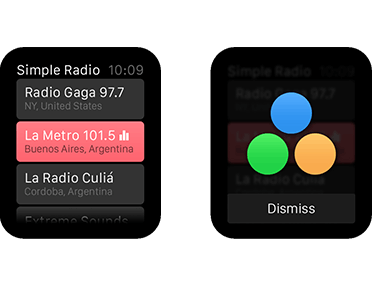
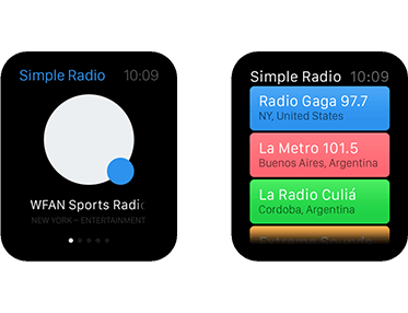
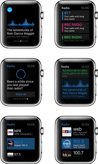
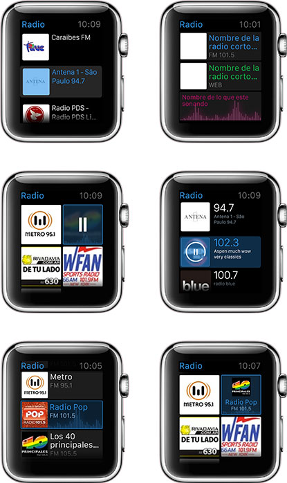
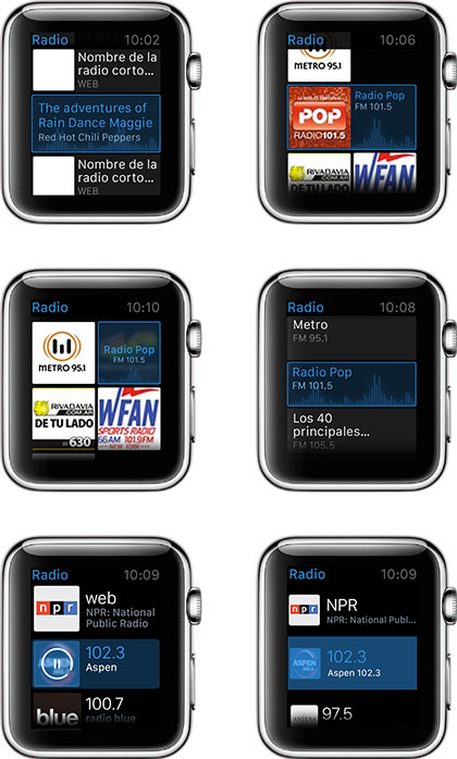
They needed us to design their App for the Apple Watch, which hadn’t been shipped yet. Even some people at Apple knew too little about it, had no guidelines, and didn’t know when the launch date was. In around 15 working days Streema needed to give their brand an extreme makeover and redesign their App for iOS. Designing for a new Apple device? Impossible deadline?

Challenge Accepted

The Super Challenging Timeline

Simple Radio Timeline

03

The_Approach

In order to achieve the project’s goals in such a short time, we gathered a team of three to work full time on the project and we stuck to a Lean methodology, keeping direct contact with Simple Radio through daily calls and instant messaging. MVP and Lean FTW!

Branding

Logo Design

Our first deliverables were fitted with Lean Methodology. After a few rounds of feedback and iteration, we finally got to work on a digital format until we were happy with the outcome.

Brandmark Concept

It was more than just a smiling radio. It was a visual system whose parts worked together to convey the core of what Simple Radio stood for.

Construction Grid

Color Scheme

Based on Streema’s guidelines, we expanded the palette and set some use guides.

Streema’s color scheme Streema’s color scheme

Typography

Proxima Nova Soft Regular

Proxima Nova Soft Medium

Proxima Nova Soft SemiBold

Proxima Nova Soft Bold

Iconography

Following the logo’s style and proportions, we developed an open and cohesive icon system.

Watch App

Given that at the time we worked with this project the Apple Watch hadn’t been shipped yet, we had to walk a stony path of research. Iteration was key as Apple kept releasing more guidelines and resources at pretty much the same pace we were working at.

MVP: First Round

First a wireframe, then came the pixel. And it was good. Testing our first ideas and approaches for the Watch UI early allowed us to find the best alternative faster.

simple radio first minimum viable product simple radio first minimum viable product

MVP: Second Round

We then started testing our ideas alongside their developer to adapt them to the watch interface.

simple radio second minimum viable product simple radio second minimum viable product simple radio second minimum viable product

The navigation mode

Since the App itself was so simple, the Watch version had to be even simpler. Wearers would only be able to listen to radios they had previously marked as favorites on the mobile app. So, what was the best way for them to navigate through their favorites stations? To answer this question, we had to imagine how they would use the Watch and when they would interact with it.

simple radio user cases simple radio user cases for mobile

App Flow

After making some decisions about the navigation, we settled on the List Navigation mode and got back to testing and designing.

simple radio app flow

App list tests

simple radio app list tests simple radio app list tests simple radio app list tests

Almost-final App

simple radio almost final app
simple radio almost final app simple radio almost final app

Animated prototypes

We made some UX prototypes in After Effects to check the interface behavior and to test every small animation that could be made. We later exported some of the assets directly from there.

iOS app tweaks

We updated the icons system, designed new features (such as Record), and developed some new animations for the App itself, always keeping it as minimalist as possible.

Icons system

We designed a few more icons based on the system we had developed for the new identity.

simple radio iOS icons simple radio iOS icons simple radio iOS icons

Animations

To bring a little more magic to the iOS App, we animated the “Play” and “Recording” icons.

04

The_Results

Check the app

Lean lean lean LEAN

Simple Radio was one of the first client projects in which we decided to use full-Lean methodology. We had read a lot about lean methodology, and we had even applied some terms on regular projects; but we had never went full-Lean on a project with such a tight deadline before. This time we focused completely on finding solutions, fast.

At the end we poured our full-Lean experience into a secret article that shouldn't be read by anyone.

I wanna read it anyway